UX Doesn't Need a UI
UI is the surface you touch; UX is what happens to the person touching it, and most of what ruins software has nothing to do with how it looks.
A few years ago my company sent me to Thailand to teach a character pipeline I'd built to a room of junior artists at the parent company. My first onsite job, and my first time teaching anyone: I'd given peers advice before, helped a colleague align an XGen description to a different scalp in Maya, but I'd never sat a beginner down and taught them something I'd made from zero.
The pipeline matters here. I'd built it for the two character artists at the company: a friend from a previous studio, and me. It autorigged a new mesh to an existing skeleton in a few clicks and packed in a pile of other shortcuts. He and I had read each other's work without talking for years; our combined time as artists was near two decades. So I never once thought about how the tool looked from outside that history.
And I hated teaching it. Nobody could follow what seemed to me the simplest things: press this, import that, combine that channel, done; the two of us could rig a character in fifteen minutes. A month in, the room still couldn't, the company was paying for all of it, and I couldn't see why. Then someone said, "I had no idea textures had different channels," and it landed. I'd been talking about morphing on UV coordinates instead of vertex IDs, packed-normal compression, gamma correction, to people just starting out. The pipeline's UX was excellent for exactly two people on earth and alien to everyone else. So I went back to my own beginning, cut the shortcuts we'd baked in, taught the fundamentals before the tool, and two weeks later they had the whole thing. That month rearranged how I see this entire subject, so it's where I'm starting.
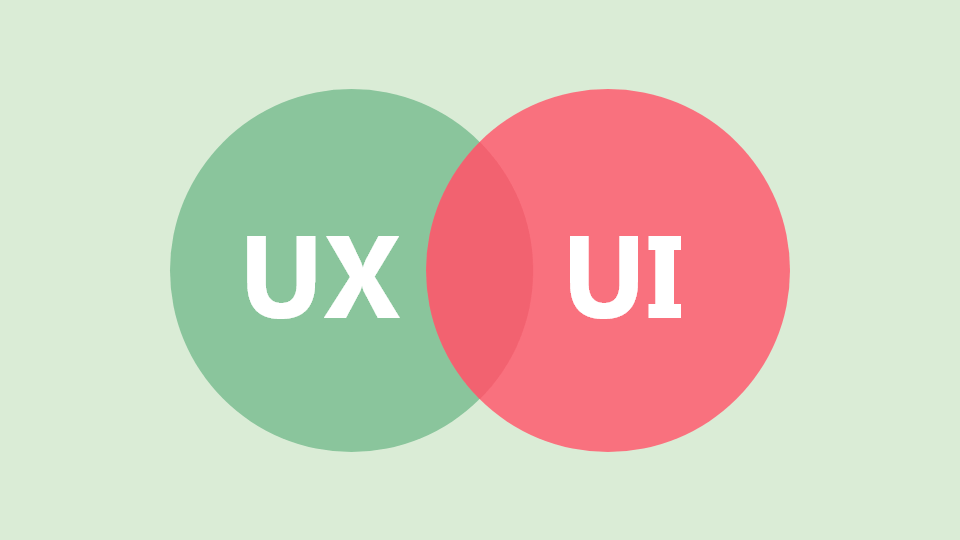
UI and UX usually arrive welded together: "UI/UX," one slash, one job posting. The slash hides a real distinction. The UI is the surface you touch: buttons, menus, type, spacing. The UX is everything that happens to the person on the other side of it: whether they found what they came for, whether it did what they expected, whether they left further along or just tired. My pipeline had a fine interface. For the juniors it was a terrible experience, and nothing about the buttons was the reason.
In a GUI the two collapse onto the same plane, so it's easy to believe the interface is the whole experience. It isn't, and the cleanest way to see that is to look at things that have a user experience and no interface at all.
UX without a UI
git. No GUI here, just a command set, and the command set is the experience. For years git checkout did two unrelated jobs, with no warning when you meant one and got the other:
git checkout main          # switch branch
git checkout -- file.txt   # discard local changes to a file
This confused enough people for long enough that Git 2.23 split the verb (git switch for branches, git restore for files) to undo the overload. No pixels changed; the fix was entirely about how the tool reads to the person typing it.
The car touchscreen. Climate, vents, mirrors, sometimes the wipers, all swept into a flat glass panel. It looks clean, and a clean interior sells cars; the showroom impression is made long before anyone drives in the rain at night. But you can't operate a touchscreen without looking at it: a knob has a position you find by feel with your eyes on the road, while a flat panel makes you hunt through a menu at speed. The usual defense ("you can't build a modern car without a big screen") isn't true. Ferrari's first EV, the Luce, was designed around physical switches and dials with the screen demoted to where it belongs, and it's unmistakably modern. It just took hiring the right people and deciding the problem was worth solving. The honest reason most cars went the other way isn't usability: Ferrari's own CEO said touch controls cost roughly half what physical ones do to build. For a company optimizing for profit the screen is the better product: cheaper to make, cheaper to differentiate in software, exciting to a new buyer, photogenic in the brochure. Every incentive points at the screen, and only the driver pays.
That's the part I keep coming back to. A carmaker has a real reason to ship the worse experience: it's cheaper and it sells. FOSS doesn't have that excuse; nobody ships my side project to hit a quarter. Strip away the profit motive and "we had to get it out the door" stops being a defense, which is why I hold my own work to a harder line than a car company's.
Caster wheels under a racing shell. The gaming chair borrows the shell of a motorsport bucket seat (high bolsters, harness slots) and rolls it on office casters in front of a desk. A racing seat exists to clamp a body against lateral g-force through a corner; a desk produces no corners. So the bolsters just dig into your ribs while you sit still for eight hours, solving a problem you don't have and creating one you now do. The look came from a context that justified it; the context didn't come along.
The deleted rear fender. Strip the rear fender off a motorcycle and it looks lean standing still. The first time it rains, the rear tyre throws a stripe of road water and grit straight up the rider's back. The styling won; the rider lost.
None of these has a UI. Every one has a user, and every one produces an experience, usually worse than the version that looked less interesting. That gap is the whole subject.
Good UI is not good UX
Back in software, the inverse is just as common: an interface that looks better while serving the person worse.
Liquid Glass, the interface Apple shipped with iOS 26, is the current example. The translucent surfaces photograph well. In daily use I find them worse: text over a live blur is harder to read, the effect costs battery and makes the device feel less responsive, and in exchange it lets me do nothing I couldn't do before. The accessibility cost lands hardest on the people least able to absorb it.
Windows 11 makes the same trade in a different register: modern-looking chrome, rounded corners, centered taskbar, while routine actions moved further away and once-instant interactions picked up a perceptible lag. Its right-click menu is a clean enough case that I've given it its own section below.
Who is actually using this
Most hard UX decisions come down to who's holding the tool, and the two ends want opposite things. A beginner wants the clutter gone: fewer choices, a guided path, defaults correct often enough that they never touch them; every extra control is a question they can't answer yet. An advanced user wants the opposite: they know what they're doing and resent being walked through it, and the abstraction that protects the beginner reads as a wall between intent and result.
| Beginner | Advanced | |
|---|---|---|
| Wants | Fewer visible choices | Direct access to every lever |
| Reads abstraction as | Safety | Obstacle |
| Failure mode | Overwhelmed | Slowed down |
| Best default | Guided, opinionated | Configurable, terse |
When the audience is only one of these, design is straightforward. The trouble is that most software serves both at once, and a layout that helps one frustrates the other.
Customization, with rails
The honest answer to a mixed audience is to let people reshape the tool, without dumping every setting into one panel and calling it freedom. Desktop Linux is the cautionary case: you can customize nearly everything, which is good, and break nearly everything just as easily, which is not. Total configurability with no guard rails just moves the difficulty from "I can't change it" to "I changed it and now nothing works."
What carries the weight is the unglamorous stuff: sane defaults so most people never open the panel, warnings before a destructive change, labels that say what a setting actually does, documentation that exists. For a deeply configurable system, a written design spec does more for the long-term experience than any single feature.
Simplicity is hard
Giving people control is half of it. The other half is presenting it so a newcomer isn't drowned, and that's where people reach for the wrong kind of simple. Simplicity in a UI is not more abstraction, not another layer to hop through to reach the thing you came for. You can hide every option behind a clean front door and shoot a lovely promo video of it, but the person opening that door forty times a day doesn't experience "clean"; they experience "slow."
When I build a UI for non-developers, the thought process is roughly:
- Group preferences into real categories, with subcategories. Not one wall of toggles: a person should be able to guess which drawer a setting is in before opening it.
- Explain in place, with tooltips and inline hints. The answer to "what does this do" belongs next to the control, not in a manual nobody opens.
- Gate the deep stuff behind a master toggle. If the tool needs advanced controls, hide them behind one switch. The beginner never sees them; the advanced user flips it once and has everything.
Which grouping is "obvious" and which hint is "enough" isn't something I can judge from my own chair; I'm the worst-placed person for it, for reasons below. I find it by putting the thing in front of people who don't think like me and watching where they stall.
Windows 11's right-click menu is the textbook case of simplicity-as-hiding. Microsoft had a real problem: the context menu had become a junk drawer, since every app you install can shove entries in. Their fix hid the overflow behind a "Show more options" click: one more click to reach commands that used to be one. It pleased no one: one camp asks how to strip items out, the other wants the Windows 10 behavior back with everything visible at once. It failed because it forced one new behavior on everyone instead of giving anyone control over their own menu.
A better shape would have handed the decision to the user:
- Ask once, on setup. The icon row for cut/copy/paste, or the classic flat list: pick at install, change later.
- Add a context-menu editor to Settings, under the personalization that already exists. Move items in and out of the overflow, toggle off any entry an app added.
- Prompt before an app adds an entry. Show a preview and ask, a last guard against the junk drawer refilling.
None of that is hard or backward-incompatible. Shell context menus are registry entries; if a random installer can write them, the OS can read, present and gate them. The capability was always there; what was missing was treating the menu as the user's space, not the platform's.
Hiding an option is not simplifying it. It just moves the cost from the eye to the click, and hands the bill to whoever uses the thing most.
Accessibility is the floor
Accessibility gets filed as a feature for if there's time left. It isn't a feature; it's the floor the rest stands on, and it's cheap built in from the start and expensive bolted on at the end. The concrete list is short and unglamorous:
- Reduced motion. Honor the system setting and drop the parallax and slide-ins for people who get motion sick, or just don't want their screen moving on its own.
- Contrast, both directions. A high-contrast mode for those who need it, and don't assume everyone wants maximum contrast; some read more comfortably with it down.
- Never carry meaning on color alone. A red dot and a green dot are the same dot to a lot of users. Pair color with a shape, an icon, or a word.
- Text that scales. Respect the OS font size and don't let the layout shatter when someone bumps it up two steps.
Then the one I underrated until recently: on a phone, keep the controls people reach for repeatedly within a thumb's arc (the lower part of the screen) because phones keep getting taller and one-handed use is the default, not the edge case.
I learned that the slow way. I've been ill for a while and working through it, tunnelled into my workstation from a bed or couch, often one-handed. A control parked in the top corner stops being a minor reach and becomes a real cost; an interface that doesn't scale across screen sizes and DPI becomes the line between finishing the work and giving up. None of it was abstract anymore. The people who needed these things all along were just easier to overlook when I wasn't one of them.
What telemetry can't tell you
Analytics tell you what happened, not whether it was any good. Twenty minutes in your app is either someone getting work done or someone hunting for one button; the dashboard logs the same number for both, and if you optimize for the number you'll happily ship the version where people are lost, because lost users generate beautiful engagement. A metric can tell you a screen is sticky; it can't tell you whether that's love or a trap. You only learn the difference by watching a real person, or asking them afterward what they were trying to do.
The curse of knowledge
There's a name for why the people best equipped to build a tool are the worst equipped to judge its UX. The curse of knowledge (from a 1989 paper by Camerer, Loewenstein and Weber) is the bias where, once you know something, you can't reconstruct not knowing it. Elizabeth Newton's tapping experiment is the clean demonstration: tappers drummed a tune on a table, certain listeners would recognize it because they could hear the whole song in their heads; the listeners, hearing only taps, almost never did.
A developer can't un-know how their system works: the confusing path looks obvious because their head fills in the missing context. That's exactly what happened to me in Thailand: the fifteen-minute rig felt simple because two decades of context were doing the work silently. It's also most of why so much FOSS has rough edges: not malice, just builders who can't see the wall a newcomer hits. The contribution model compounds it: a developer can spot a bug and open a pull request in minutes, but a meaningful design change can't be cut that small, so it rarely gets made.
The friction between the camps is real, and both have a fair complaint. Artists who try to contribute often describe being dismissed: the "contribute code or get out of the way" reflex, where design feedback isn't treated as contribution. Developers counter that designers want paying for work everyone else volunteers, and that proposals ignore what's implementable. Both are true at once, which is why so much good engineering ships with an interface nobody outside the project can love.
Test it on everything, with everyone
The cure for the curse of knowledge is exposure to people who don't share it. If it's a website, test it on every device you can get your hands on, under network conditions worse than your office: the thing that's instant on your wired connection is a blank screen for thirty seconds on a train.
More important, get feedback from people unlike you. I hand my work to my wife, who does QA in fashion and isn't especially technical, and her reaction is some of the most useful signal I get. If she can look at a button and guess what it does, the affordance works; if she can't, the label or icon is wrong, and no amount of me knowing what it does will fix that. The value isn't her expertise; it's eyes that haven't been trained into my blind spots.
Don't break a convention you can't explain
Novelty for its own sake is a tax the user pays so the designer can feel original. I lost real time to one on Vercel's dashboard: on mobile, the control that opens the side panel shows up as two short vertical bars at the bottom, next to the search field, where every other site I use puts a hamburger menu at the top. I looked top-left, found nothing, and spent far longer than I'd admit working out where the panel lived. The change bought nothing: not clearer, not faster, just different from what my hands already knew.
A convention is accumulated user knowledge. Break one and you've quietly volunteered to re-teach everyone who already knew the old way.
Deviating is fine when the new pattern is more obvious than the old, or you can teach it in the moment. When you can't do either, you're not innovating; you're charging admission.
Function first, or you lose them later
The one-line version of all this: never trade away what the tool does to make it look better. A polished surface wins first-time users (a good screenshot sells an install), but people stay because the thing works, and the moment beauty starts costing function, the people already onboard are the first to leave. Looks get you the install; only the work gets you the second visit.
Why I spend the time
Tech artists sit in an odd spot between the camps. I can read a profiler and a layout grid: tell a developer why their menu is slow to render and a designer why their gradient will cost a frame. That overlap is the bridge most FOSS is missing, and part of why I pay UX as much attention as I do in a field that seems to value it less every year.
So when I put a project out, I do a few specific things, none of them decoration: customization that doesn't bury a new user, documentation that exists, screenshots in the README so someone can decide at a glance instead of cloning to find out, and a CLI or API where developers are the audience so they never feel tied to a UI I picked. It's slow and it doesn't really benefit me; I'm not selling anything. Now and then someone messages to say a project was genuinely pleasant to use, often someone I'd never have expected to touch it, and I didn't build any of it expecting that. But the reason isn't the messages. It's that if I'm asking people to use something I made, the least I owe them is that it not hurt to use.
The lesson
"Git good" is a comfortable mindset for those of us who build the tools. I had it. When someone struggles with something I made, the easy read is that they didn't try hard enough, and it's almost always wrong. The friction in that classroom was never a lack of intelligence; it was a lack of the specific context I'd stopped being able to see I had. The juniors weren't slow. I'd forgotten what not-knowing felt like.
For what it's worth, we went out drinking near the end and closed it with no grudge: they'd learned the pipeline, and I'd learned something more useful than the pipeline. It's the lens I point at everything now: the aircon panel in a car, the seat on a motorcycle, why one piece of software feels like home and another like a fight. Same question every time: who's on the other side of this, and what do they actually know.
UX is the slowest part of a build and the easiest to cut, because unlike a failing test it doesn't turn anything red. Nothing breaks if you skip it; the build still ships. That's what makes it dangerous to treat as optional: it's load-bearing in a way that doesn't show until a real person stands on it. The duty of an engineer is to hear feedback and act on it, not outsource that judgment to a dashboard that can't tell productivity from confusion. The plumbing has to be robust and the code correct; so does the experience of the person who sees neither. Same job. I'm no expert at it; I just decided to care, and a room of patient juniors in Thailand is most of the reason why.
This is an opinion piece, not a citable study: a set of conclusions from years of building things, breaking them, and watching people use what I made. Where I've named a product or a number I've tried to get it right, but the judgments are mine, and yours may differ. If they do, I'd like to hear why.